If you want to really hook consumers through local advertising via Facebook ads, you need to do more than just take advantage of the social giant’s detailed user data and powerful targeting capabilities. Start optimizing the content creative of the ads themselves, and you’ll not only reach the right consumers, but reach them at maximum impact.
To fully take advantage of this local market opportunity, you must leverage your retail network. Partner with your retailers to reach and engage the consumers who matter most (people who are both interested in purchasing your product and near your retailers’ stores), and you’ll begin turning digital traffic into actionable foot traffic.
Based on our experiences optimizing client campaigns with Promoboxx Local Ads, here are five best practices that will help you land on Facebook advertising creative that will resonate with your local audiences and convert those impressions into customers:
Facebook has a thorough series of best practices and guidelines for advertising on the platform. Knowing the ins and outs of the text policy, what you can and can’t feature (anyone under 21 cannot view images of alcohol), and more is critical when creating your ads.
Before even starting to think about creative, take the time to review their guidelines. It will save you from some serious headaches, ad failures, and poor performance in the future.
When consumers are furiously scrolling through their Facebook News Feed, you run the risk that they will scroll right past your ad. To stand out among the baby pics, engagement photo shoots, and any number of other Facebook ads, your ads must feature a compelling image. This image is your best shot at making your audience stop, rewind, and give your ad a longer look.
Facebook’s ultimate goal is to show consumers relevant content that they will like and, hopefully, interact with. They’ve studied results from advertising campaigns across multiple industries and have a secret sauce for images that will resonate with consumers. Luckily, that secret sauce isn’t much of a secret at all. It’s all published right on their website.
A few of their design tips recommend featuring people using your product rather than an image of the product alone, as well as making sure that you’re showing the benefit of the product. Other tips are more standard, including use of high-resolution images and keeping the message of your image simple.
As an example, from our client experience in the home and appliance space, we learned that millennials and men responded strongly to ads for one line of products, whereas women who were 35-65 engaged more with ads for another product line.
The branding involved in ad content came into play here: the ads that attracted a higher percentage of millennial males had darker colors and more dynamic copy, whereas the ads that attracted the older, more female demographic had a much lighter color scheme and more subdued copy.
Related content: Convert Impressions into Customers with Facebook Targeting >
Once your image captures the attention of a consumer, you only have 90 characters or so to get your message across before they move on. Keep your text short and sweet for a better chance at conversion. If you need to add more than 90 characters, make sure that the most important part of the copy is at the beginning of the text.
If you have a Call-to-Action (CTA), also include that in the first 90 characters, which leads us to…
When running an ad, you should always consider what goal you are working towards. Do you want your customer to redeem a coupon? Buy a product? Enter a contest? Use that goal to develop your CTA.
Short, actionable phrases such as “Learn More,” “Shop Now,” or “Enter Here” perform best. Remember: feature it in the first 90 characters of your ad for the strongest chance at conversion. Optimizing this portion of the ad will improve your CTA and, ultimately, help the consumer quickly understand what’s in it for them if they click through.
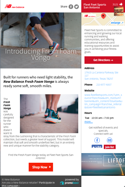
Once your consumer clicks through on your newly optimized ad, the last piece of the puzzle is getting them to convert and take that desired action. It’s helpful to have your ad redirect to a page built specifically with the ad in mind.
Developing a landing page for your ad is an ideal solution in that you can ensure that the CTA in the ad copy is easily executed right there on the page. Redirecting to a more generic page or website can create confusion and, ultimately, drop-offs. Ensuring that cohesion will help you achieve the end goal you originally set for yourself.
When running Local Ads through Promoboxx, we always recommend that our clients take advantage of our landing page functionality when creating a destination for their ads. These pages are mobile-optimized and automatically co-branded with the retailers’ information. Best of all, this ensures that the landing page has a straightforward CTA that matches the information in the ad.

Mobile-optimized landing page for New Balance retailer
Once you begin to implement these creative best practices, you will ensure that your advertising dollars are being spent in the most efficient way possible: engaging local customers on digital channels and inciting them to make purchases in your retailers’ stores.
Join Trek Bikes, New Balance, and other leading brands leveraging Local Ads to team up with their retailers and unlock the full potential of untapped local audiences.
With Promoboxx Local Ads, brands simply and effectively extend their sophisticated content, targeting, and media mix to resource-strapped retailers, reaching new local customers on mobile devices and driving them in-store.
Convert Impressions into Customers with Facebook Targeting >
The Promoboxx Approach: Maintaining Transparency in the Digital Age >
Promoboxx Doubles Down with New Retailer Experience [Product Update]
